Space as a Community: The Super “G” Mart

The other day I had to stop and pick up some milk on my way home from work. I was in an unfamiliar part of Charlotte but I knew there was a grocery store on Independence Boulevard called The Super “G” Mart. I stopped into this store on November 28th, 2012 and was amazed at what I saw and experienced.

The "A" on the map identifies where the Super "G" Mart is located.

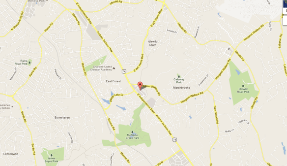
The “A” on the map identifies where the Super “G” Mart is located.

The Super “G” Mart is an international grocery store off Independence Boulevard in East Charlotte. This grocery store serves the Latin American and Asian population of Charlotte. This store also serves as a third place for many members of these communities.

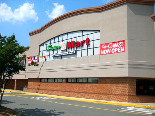
The Super “G” Mart is an International grocery store that serves the Latin American and Asian population of Charlotte

This grocery store is distinctively set up in two separate arenas, when entering the store the left side of the store is Latin American imported goods, including spices and prepared meals. The right side of the grocery store is stocked with Asian foods, including noodles, fish, and dumplings. The Super “G” Mart is stocked with items one would not find at a traditional grocery store like Harris Teeter or Food Lion.

What struck me most about this space is that the Super “G” Mart is being used as a great third place according to Oldenburg. The grocery store individually leases spaces on the perimeter of the store which are being used by businesses to sell services and transform the space into a village.

This is an example of one of the many shops that is in the Super “G” Mart

These shoppes range from a manicure / pedicure boutiques where I noticed women conversing in a native language, a post office, restaurant, and stores which sell imported  items from Latin America and Asia. The one I found most interesting was a space where a couple was selling Japanese electronics and appliances including the high tech toilets that members of the Japanese society covet.

This is an example of a store selling hi-tech Japanese toilets in The Super “G” Mart

When walking the isles and observing these spaces in The Super “G” Mart I noticed that people were talking to one another as is they are friends. The characteristics of the third place provide an escape from the home and work spaces, and this space identifies a place in which a different culture uses a space to escape (Oldenburg, 21).

The Super “G” Mart as a third place is being used as a leveler. Economically, I noticed many different status groups convening in this space, and they talked to one another as equals. As I walked the aisles checking out the goods and observing the people in the space I was approached on multiple occasions. Many times it was a store clerk asking if I needed help, but on several occasions I was approached by patrons of the store just to say a simple “hello” inviting me to talk to them. I believe they recognized me as someone not familiar with the space of The Super “G” Mart, and are trying to help me assimilate with the culture of this space.

This “help yourself” bucket of live blue crabs in the “Asian” section of The Super “G” Mart is an example of something you wouldn’t come across in a traditional grocery store.

In Oldenburg’s “The Great Good Place” he identifies that conversation is the main activity of a third place, and clearly, patrons of The Super “G” Mart tried to engage in conversation with me (Oldenburg, 26-27).

The Super “G” Mart is a delightful place to see another side of Charlotte and the cities culture. This space is available for grocery shopping, it is also a place available “to escape the pressures and frustrations of the day…amid good company” (Oldenburg, 32) which is a powerful resource for any community.

The Signage of the Alex Theatre

The Alex Theatre in Glendale, California is the centerpiece of this communities art, culture, and community programming. The establishment frequently produces classical music acts, ballet performances, live theatre, stand-up comedy, and serves a location for on-site movie, television, and commercial production.

The grand Alex Theatre identification sign.

The grand Alex Theatre identification marquee.

The identification signage of the Alex Theatre clearly marks this space as a place for arts and culture in the Glendale neighborhood, however by evoking imagery through signage this sign also communicates the personality, character, wayfinding, and historical context of this space.

The Alex Theatre is centrally located in the Glendale suburb of Los Angeles.

The Alex Theatre is centrally located in the Glendale suburb of Los Angeles.

The identification sign of the Alex Theatre symbolizes it’s personality in Los Angeles’s of theatrically produced content identity. Glendale and the surrounding communities of Burbank, Hollywood, and Studio City are home to all major television and movie production studios. Many workers of these studios call Glendale home, and the prominence of the Alex Signage symbolizes the personality of being a ‘home’ for theatrically produced content.

Another view of the Alex Theatre marquee

Another view of the Alex Theatre marquee

The character of the Alex Theatre signage symbolizes the proud heritage of the communities involvement with the film industries that support Glendale. The large scale of this identification sign in comparison with other identification signs in Glendale provide a building block of wayfinding in the community. The size and elaborate design of the Alex Theatre sign indicates this is a primary destination for Glendale residents. The character impression that the Alex Theatre displays is one that symbolizes that the Glendale community embrace performing arts and it is a backbone of the community.

The Alex Theatre identification sign promotes the historical importance that the film and theatrically performed arts industry plays in this community. The Alex Theatre was built more than eighty years ago, during the “golden age of film” a time when thousands of movies were produced at Hollywood film studios.

The Alex Theatre during the premier of "Ben-Hur" in 1959.

The Alex Theatre during the premier of “Ben-Hur” in 1959.

The font of the Alex Theatre was popular in the 1940’s and the decision to keep that font the same throughout all these years shows the historical importance the “golden age” era means to this community still.

As a symbol of proximity the Alex Theatre sign can be used in determining location (way finding). For example, the sign and it’s spire dominate the downtown Glendale skyline. If one is meeting another party in the downtown Glendale area for dinner or drinks and they don’t know where to meet at. They can use the Alex Theatre marquee as a central meeting place to discuss dining options before walking there. It should be noted that downtown Glendale is a very walkable city. The downtown area is a mere 5 blocks and one can walk it’s entirety in less than 10  minutes.

The theatre has gone through multiple renovations throughout it’s eighty year history, however the grand marquee has stayed the same. This symbolizes the prominence this establishment and it’s identification signage have with the residents of Glendale. The identification signage of the Alex Theatre displays the correct personality, character, and historical context of this space, community of Glendale, California, and it’s residents. The City of Glendale uses the Alex Theatre for more than a place for performing arts, they use is as a symbol of what the community strives to be, a participant in the theatrically performance production community of Los Angeles.

A Third Place: Sports Page Food & Spirits

With Americans increasingly working longer hours there is a recommendation for a third place within an individuals second place (work setting). For the crew of CW46 that place is Sports Page Food & Spirits near Denver, NC. This quaint restaurant and pub serves a meeting place for coworkers to grab lunch on their break or enjoy a few cold beverages after work.

Sports Page Food & Spirits serves as a great third place because it is closely associated with Oldenburg’s characters of a third place let’s investigate further…

Sports Page Food & Spirits is located in Denver, NC

Sports Page Food & Spirits (A) is located in Denver, NC

Oldenburg states that for a third place to be great it must closely adhere to the following characteristics…

1. Be an escape from home and work.

2. Be on neutral ground.

3. Promote conversation as the main activity.

4. Have regulars.

5. Keep a playful low profile.

6.Be a home away from home.

7. As a leveler.

(Oldenburg, 21-41).

Sports Page Food & Spirits does this for the sales force of CW46, for instance we use this place as an escape from work. Many times during a hard morning of work members of the sales team will e-mail one another and ask if anyone is interested in grabbing lunch. Typically when another party agrees to lunch they also agree to hear grievances about their day and act as a therapist of sorts. Typically, both parties find an agreeable work topic to discuss and they engage in conversation. If there are not work grievances to discuss, conversation still flows organically but it is typically small talk about family, sports, friends, etc.

Sports Page signage as you enter the establishment.

Sports Page signage as you enter the establishment.

Sports Page Food & Spirits is on neutral ground for CW46 employees to use as a third place. Meaning, the proximity of the restaurant to the office is ideal, a short 5 minute drive at worst. This establishment can be identified as a neutral space because it is not near any employee home space (first place), and no CW46 employee has a stake in the success or failure of the business.

As discussed earlier Sports Page Food & Spirits promotes conversation as the main activity. Outside of our circle of CW46 coworkers, engagement with other people in the restaurant is frequent and easy to engage in. Sports Page Food & Spirits is a local establishment and many times conversation can be started simply by discussing things going on around the community.

Coworkers engaging in conversation during lunch.

Coworkers engaging in conversation during lunch.

Sports Page Food & Spirits is an establishment built on local regulars. The tavern is designed like a typical neighborhood sports pub, there is nothing special to attract visitors to this establishment if they did not live near it. However this establishment recruits regulars by sponsoring local youth sports leagues and they promote food and beverage discounts for the team after games. This allows Sports Page Food & Spirits to establish a base of regular business and promotes new patrons with word of mouth to new parents and their children playing in youth sports.

This establishment has the distinctive playful low profile of an “Anywhere U.S.A.” tavern. The lighting is dim, popular music is playing on the juke box, multiple televisions are playing different sporting events, and there are opportunities to sit at a bar to engage in conversation with the bartender or sit at a table and engage in a private conversation.

The low profile of Sports Page Food & Spirits

The low profile of Sports Page Food & Spirits

Sports Page Food & Spirits is a home away from home for many of their patrons. Unlike the CW46 sales staff many of the regulars of this establishment live within a “stones throw” of this tavern. I have not engaged the conversation directly with regulars, however, I notice that the same people visit this tavern at the same time daily. Many of these regulars come in to get a quick drink and discuss their day with the bartender, and then leave. This shows that regulars of this tavern associate Sports Page Food & Spirits as their home away from home and use it as such.

Lastly, Sports Page Food & Spirits is a leveler meaning all walks of life frequent the establishment. When I visit this establishment for lunch the customer base is diverse, and this place promotes an all walks of life customer base. A typical observation of the tavern shows regulars sitting at the bar enjoying a beer and conversation with the bartender, and white collar and blue collar co-workers will be sitting at tables discussing issues at work.

With few dining options in this neighborhood, parents frequent this establishment as a place to take the family out to dinner, and they typically sit along side teenagers meeting here for a weekend lunch to socialize with their friends.

Sports Page Food & Spirits embodies Oldenburg’s characteristics of a great third place. This tavern promotes engagement within the community by placing a priority on serving the community. In return this priority promotes a base of local regular cliental who use this space as a way to communicate with neighbors.

User Experience: Santa Monica Pier

The Santa Monica Pier is located on West Side of Los Angeles, north of the Los Angeles International Airport it begins “The 10” Freeway and “The PCH” Pacific Coast Highway.

ImageSanta Monica Pier is labeled “A” on the map

The pier is a popular destination where locals and tourists combine to enjoy the California sun, surf, and beach. The user experience of the Santa Monica Pier is unique in that it is a multipurpose space where one can experience the Santa Monica Pier as a tourist or a local. This is a best case scenario for this space because it is hard to notice a tourist if you are local and visa versa, let’s investigate further.

The entrance to the Santa Monica Pier is inviting to tourists and locals alike.

The Santa Monica Pier entrance welcomes the visitor with a grand neon identification sign. The entrance allows visitors to drive through to the parking garage, walk, or bike to the actual pier. The physical interaction of this sign is not emotional, it is more of an identifier that you have reached your destination. When I visit this location I use the Santa Monica Pier sign as a reference point.

When you enter the pier there are an array of activities. When walking towards the Pacific Ocean to your left is an amusement park with a small roller coaster, a ferris wheel and other amusement park rides. As I observed, this space is typically used by inland Los Angeles residents who use Santa Monica Pier and it’s amusement park as an escape from the hustle and bustle of living in Los Angeles.

This ariel view of the Santa Monica Pier shows the small amusement park. This space is a welcomed break for local residents from the hustle of Los Angeles.

This ariel view of the Santa Monica Pier shows the small amusement park. This space is a welcomed break for local residents from the hustle of Los Angeles.

If you are walking towards the Pacific Ocean to your right is a few tourist boutique shops which sell novelty souvenirs and other trinkets, they extend out about halfway up the Pier. Past the shops is a wide open view of the ocean, beach, and City of Santa Monica. I observed that this is the place where most pictures were taken. It is believed that this was a strategy of the developer because the sun is always to your back which makes for a better picture.

IMG_1258

If you walk past the amusement park and reach the end of the pier there are two levels on which you can go. The top level is for taking pictures ad soaking in the scenery of Santa Monica and it’s Pier, the lower level is for fishing. This multi-level approach allows for tourists and local Los Angeles residents to use the space in a multipurpose fashion.

The Santa Monica Pier is a wonderful user experience for everyone who visits. The space is multi-purposeful, meaning that it allows all people to enjoy it. Best of all, there are so many opportunities to do different things in this space that you don’t notice the tourists, or the locals, or the fisherman, or the children in the amusement park. Santa Monica Pier offerers a great user experience it offers a great way to mix locals and tourists of Los Angeles into the same space.

The replacement of a third place with a really (really) big first place

According to Oldenburg’s reading The Great Good Place we are in search of a “quest for community”. American’s today are isolating themselves in elaborate suburban homes, typically these suburban lifestyles do not inhibit a sense of community and in turn a reclusive identity is forming with residents of these suburbs.

One can debate that the bigger home an individual owns (their first place), the less they rely on a community place for fulfillment. The example of this home in Waxhaw, North Carolina demonstrates how it and the community around it compensates for the loss of an adequate third place.

Does a big house in the ‘burbs’ fill the void of missing third places?

Waxhaw, North Carolina is an affluent suburb south east of Charlotte. Up until a decade ago, this area was mostly cow pastures and corn fields but the rapid growth of Charlotte as a whole made developing this area desirable by many.

Waxhaw, NC is a S.E. suburb of Charlotte.

While developed suburban neighborhoods have been popping up around this area for years, other communal necessities are slow to follow. Grocery stores and gas stations are typically the first retail developments in this area, and later on chain restaurants, and retail shopping follows.

As I observe homes while driving through Waxhaw, NC each home looks much larger than a home inside the I-485 loop of Charlotte. It’s easy to believe a typical Waxhaw home to have at least 5 bedrooms, large open spaces, a half acre fenced in lot, and great landscaping. The vast home space could(and is) be used as an alternative as a third space.

A pool room invites guests to the home with an opportunity to communicate over a match.

For instance, while in the home pictured above I noticed many areas to invite others to create conversation. This home has an area to play a game of pool, a sitting lounge, and a big backyard patio. These areas are all identifiable characters of a third place, and can aide in escaping the stress involved with daily life.

This formal sitting area promotes conversation with all parties.

Using a really (really) big house as a third place has benefits to people in communities where a third place is not an accessible option, however it lacks being a leveler, meaning “reducing all men to an equality”. Simply stated, using your own home as a third place could not seem equally inviting for every patron entering your property.

The back patio can help to promote the image of a third place in a home.

For instance, at this home, a patron who is not familiar with a formal sitting room might feel intimidated in this space. It is full of expensive furniture, art work, and other decor, it could leave the patron anxious for an escape if they are not accustomed to this type of environment.

This lack of neutral ground is also present with the pool table gaming area. It should be obvious that if someone with a pool table of their own challenges you to a game, they are most likely good at that game. If the challenged opponent is not as familiar with the game, it could limit informal relations among guests. The neutrality of the playing field is compromised by the ownership of the pool table inside of the home.

In conclusion, using a really (really) big home as a third place is a compromise of space. In a bind it can be used, but this should be done sparingly. Public engagement in traditional forms is always recommended and encouraged over using personal space as a third place.

The intersection of Parkwood, 12th St, and I-277: A recommendation for improved signage

The intersection of Parkwood Avenue, 12th Street, and I-277 have serious identification and directional problems. If one is traveling from Parkwood towards 12th Street / I-277 you must make a left hand turn at this intersection. If you are in the lefthand lane on Parkwood Ave you must enter I-277, if you are in the righthand lane you must turn on 12th street.

I travel this road daily and it is common place for travelers to be in the wrong lane. This leads to congestion which slows down the process and at peak traffic times that leads to backups. Simple identification signage can help this issue. Let’s investigate further…

The intersection of Parkwood Ave, 12th Street, and I-277 is denoted by a red box through it.

When you are approaching the intersection from Parkwood Avenue you must travel up a small hill to a typical generic street. This part of the street is flat, straight, and lined into two separate lanes. There is not much to be desired and this leaves the driver to take a passive approach to driving towards this intersection.

After a small hill travelers on Parkwood Avenue are faced with a traditional stretch of flat, straight road before they hit the 12th Street / I-277 intersection. This could promote passive driving.

After this short stretch of road is navigated by a driver they are quickly shuffled into the intersection with 12th street and I-277. If you are in the right hand lane you are able to see a small sign which identifies which lane takes you to what street, if you are unfortunate enough to be in the left hand lane (and not familiar with this intersection) you do not have any such signage to identify that your lane will take you to I-277.

Shortly after you are on the passive stretch of road you hit the 12th Street / I-277 intersection. You must turn left at this point, and it is hard to navigate which lane takes you to which street.

I travel this road often and know to get into the left hand lane to enter onto I-277. At this point I tend to look for wary travelers who don’t know if they are in the correct lane or not. A frequent observation of drivers in the right hand lane stay there until they see the only identification sign (20 feet from the intersection) that notifies them that they need to be in the other lane to enter onto I-277. At this point I notice a flurry of left hand turn blinkers and aggressive attempts to merge into the left hand lane.

This sign (20 feet from the intersection) is the only identification sign to inform drivers which lane they need to be in.

A recommendation to ease confusion with this intersection would be to incorporate more signage leading up to the intersection. There should be at least two more of these identification signs to inform drivers which lane to be in. One at the top of the hill before you enter the passive stretch of road, and another one on the left hand of the intersection so travelers in that lane can recognize the correct lane to be in.

Over-head signage is another recommendation to help identify which lane a driver needs to be in. This could drastically help with the confusion led congestion that this intersection has. It will aid in identifying the proper lane a driver must be in to turn onto the right road.

This overhead street identifies which lane drivers must be in. It helps with the congestion caused by confused drivers.

If the City of Charlotte would consider adding additional identification signage to this intersection it would cut back in the confusion that many drivers have with this intersection. At this point in time this is nothing more than a mere headache to enter I-277 from this intersection, a more drastic approach would be to consider when something more serious than “a mere headache” will happen to cause action.

Queue Theory: Target Midtown Parking Deck

The parking deck at Target Midtown is confusing to navigate, it is a three level structure with entrances at the first level from 3rd street and at the third level from Kings Drive. Target is on the third floor of the attached shopping complex and the other retail space is not occupied by any other businesses.

The design of Target Midtown’s parking garage is difficult to navigate.

Signage to direct traffic to Target from the first floor of the parking deck is hard to find. It is placed high above the peripheral vision of a person entering which makes it easy to miss when entering. At this point, if you are entering from 3rd street you must make a hard right into the garage to proceed to the ramp to the additional levels of the garage. If you are not familiar with the parking lot it is easy to confuse the “up” ramp with the “down” ramp which can be hazardous.

Entrance to the Target Midtown parking garage (on your left) The stop sign is even difficult to see behind the trees

If you are able to navigate your way to the “up” ramp, proceeding to Target gets a bit easier, it is a straight shot to the third floor with access to the second floor of the garage. Once on the third floor you need to find a place to park, which can be difficult. All traffic to Target flows to this level of the garage and in many instances finding a parking place is difficult at best.

There are the only two signs pointing drivers how to get to Target, if you miss them you are out of luck.

If you can’t find a parking spot your only move is to proceed back to the second or first floor of the garage. Which again, is a confusing mess. The first reaction of the driver is to proceed back to the “up” ramp. If you accidentally turn on this ramp the only way to know you are going in the wrong direction is a white arrow on the surface of the garage pointing up. In comparison the “down” ramp is on the exact opposite of the “up” ramp and is difficult to find, this is due to it’s proximity to traffic flow. When entering the third floor of the Target Midtown parking garage from 3rd Street you come out on the north end of the garage, then the organic traffic pattern directs someone towards the store to find a parking spot near the entrance.

Make a hard left into the parking garage from 3rd Street and this is how you get to the 3rd floor where Target is.

The signage on the third floor of the parking deck is identical to the first floor entrance from 3rd Street. This aids in the confusion of how to proceed to parking places on other levels of the garage when there is a need to do so.

The information signs can be quite confusing!

A recommendation to make this space easier to navigate would be to incorporate bigger brighter signage in better places. For example, when entering the garage there could be a digital sign that provides information of how many empty parking places are on each floor of the parking garage. This would help eliminate unnecessary traffic to the third floor of the parking garage as drivers would know that it is easier to park on the first or second floor and walk to Target.

An example of a digital parking sign which identifies how many empty parking places are on each level of the parking garage.

Signage directing traffic to the “up” and “down” ramps should be placed at eye level of the driver and should incorporate large bold lettering, and arrows to help direct traffic. A final recommendation would be to place identification directly on the floor of the parking garage. If done in bright colors this would help patrons navigate their way to the store.

The typically packed third floor of the Target Midtown parking garage.

These three observational recommendation can immediately help with traffic flow in the Target Midtown parking garage. A long-term study to look at implementing best measures should be done to determine if more could be done to make this parking garage easier to navigate.

The I-485 & I-85 turbine interchange and the opportunity for a great Highway Eddy

If you travel I-85 north of Charlotte you notice a big construction project underway. This is the final interchange to connect I-85 with I-485. The North Carolina Department of Transportation (NCDOT) is implementing the largest turbine interchange in North Carolina. This design will allow for vehicles to navigate the interchange easy with minimal decrease in speed.

This Map shows the final expansion of I-485 to I-85. When complete, this will connect the I-485 outer loop. The area R-2123CE is where the turbine interchange is being constructed.

A project of this size will create open spaces when complete and this could be a perfect opportunity to create a large scale Highway Eddy. As describes in Roman Mars 99% Invisible podcast, the potential for these spaces in traditionally dead areas are new avenues for city planners to focus time and resources to develop a creative space in this land area.

This is how the land around the I-485 & I-85 interchange looks today.

The area where the turbine interchange is being created was once lush with trees. The interchange is nestled in between the suburbs of University City and Concord both with a specific identity.

The UNCC Crown logo is simple, and can be easily recreated in the I-485 / I-85 Highway Eddy with the use of inexpensive shrubbery.

University City is Charlotte’s largest suburb, it is the home of the Charlotte campus of the University of North Carolina, and it is a hub for major companies such as IBM, Electrolux, and Speed Channel. The suburb of Concord is a still developing community that is home to Charlotte Motor Speedway where NASCAR races twice a year.

It would be recommended to design the space in this Highway Eddy to assimilate with these communities. For instance, in a similar Highway Eddy in Uptown Charlotte, a floral landscaping design to resemble an American flag was constructed during the Democratic National Convention. Options for the I-485 / I-85 Highway Eddy could be to replicate this idea yet make a landscaping pattern in that of the UNCC logo, and a black and white checkered flag to identify this area with the two prominent features of this area.

Example of a how design can beautify a Highway Eddy. This red, white, and blue pattern resembles an American flag and was created for the DNC. A similar design can be used for the I-485 I-85 Highway Eddy

Another opportunity for the I-485 / I-85 Highway Eddy would be to return the land as best as possible to it’s original landscape. As previously mentioned, before this land was cleared to make way for the turbine interchange it was lush with trees. Replacing the cleared trees with new ones in the green area can help community members reengage with this parcel of land as they did before construction began.

This picture from the NCDOT suggests that replanting trees in the green areas of the Highway Eddy are currently planned and budgeted for the project.

The I-485 / I-85 turbine interchange is revolutionary. The design is relatively new and it has not been incorporated on a wide-scale level. This turbine interchange will be studied by researchers and civil engineers alike. It is recommended that the developers do everything they can to ensure it’s positive impact in the community for the community and future studies.